
Florist Farms is a farmer-first craft cannabis brand built on a “plants + people” visual system: earthy palettes, hand-drawn iconography, and lush botanical photography applied consistently across packaging, digital, and merchandising. The one rule that governs every asset is simple: if it doesn’t tie back to the farm, the farmers, or the community around them, it doesn’t belong in the Florist Farms brand.
TL;DR:
- The brand emphasizes farm origin, sustainability, and transparency, aligning all packaging and marketing to these core values.
- Used across assets, earthy colors, hand-drawn iconography, and real farm photography reinforce the authentic, farmer-first identity.
- Consistent logo application, approved color and typography standards, and regular brand audits are crucial to maintaining visual integrity at scale.
- Targeted messaging appeals to values-driven consumers, newcomers, and dispensary buyers, avoiding hard-sell language and neon aesthetics.
- Owned channels, packaging, and email are primary for marketing, as platform restrictions limit paid social advertising in the cannabis industry.
Table of Contents
- What Is the Florist Farms Brand Guide Built Around?
- What Defines the Florist Farms Visual Personality?
- How Should the Logo Be Used Across Assets?
- What Are the Color and Typography Standards?
- What Photography and Iconography Standards Apply?
- What Deliverables Does the Brand System Cover?
- How Do You Keep Production Consistent at Scale?
- Who Is the Florist Farms Brand Actually For?
- A Creative Lead’s Take on Staying Authentic at Scale
- Where to Find Official Florist Farms Assets
- Sources
- FAQ
What Is the Florist Farms Brand Guide Built Around?
Florist Farms launched into licensed New York dispensaries on December 29, 2022, becoming the first legal cannabis brand to hit shelves in the state. Founders Allan Gandelman and Karli Miller-Hornick built the company on a decade of agricultural experience before cannabis was even legal in New York, and that farming background is the reason the brand reads as authentic rather than manufactured.
The company describes itself with USDA organic claims, solar-powered extraction, and reinvestment in the Cortland farming community where it operates. Those aren’t backstory footnotes. They’re the raw material every designer and copywriter should pull from:
- Farmer-first: every asset should feel like it came off the farm, not out of a boardroom
- Sustainability: organic growing practices and solar power belong in packaging language, not just the “about” page
- Transparency: lab results, sourcing, and process should be easy to find, never buried
- Social fairness: living-wage labor and worker support are part of the brand story, not a footnote
A brand guide that ignores this origin story ends up producing generic cannabis marketing. Florist Farms only works when the farm stays visible.
What Defines the Florist Farms Visual Personality?
The tone is warm, unpretentious, and grounded. Copy should sound like a farmer talking to a neighbor, not a lab technician reading a spec sheet. Think short sentences, active verbs, and language that names real things: soil, sun, hands, harvest. Skip clinical cannabis jargon unless a regulatory panel requires it.
The agency-built identity leans on hand-drawn iconography, an earthy color palette, and botanical photography to create what the design team calls a fun, friendly, down-to-earth feel. That combination is what makes “plants + people” more than a slogan:
- Iconography carries the hand-drawn warmth when photography isn’t practical (small packaging panels, social icons)
- Color grounds everything in soil tones and greens rather than the neon palette common in cannabis branding
- Photography puts real growers and real plants in frame, favoring lifestyle shots of hands in soil over sterile product-on-white shots
Lifestyle photography should lead on social and web. Product-hero shots earn their place on e-commerce listings and packaging fronts, where the customer needs to see exactly what they’re buying.
Pro Tip: When a campaign has to choose between a polished studio shot and a slightly imperfect farm photo, pick the farm photo. Florist Farms’ entire value proposition depends on looking real, not retouched.
How Should the Logo Be Used Across Assets?
The logo system runs on a primary lockup and at least one secondary mark for tight spaces like vape cartridges or social avatars. Getting this wrong is the fastest way to make a craft brand look careless.
- Use the primary lockup on packaging fronts, hero web banners, and any asset with room to breathe; reserve the secondary mark for icons, favicons, and small merchandising items.
- Maintain clear space around the logo equal to at least the height of its wordmark; never let text, photography, or icons crowd inside that margin.
- Respect a documented minimum size for print and web so the hand-drawn detailing doesn’t blur or disappear at small scale.
- Only place the logo on backgrounds that meet contrast requirements. Never drop it onto a busy botanical photo without a scrim or solid color block behind it.
- Never stretch, skew, recolor outside the approved palette, or rotate the mark. Distortion is the single most common misuse flagged in creative review.
What Are the Color and Typography Standards?
The palette leans on earthy greens, browns, and warm neutrals as primary colors, with a small set of accent tones reserved for calls to action and highlight moments. That keeps packaging from looking either sterile or overloaded.
Typography follows a simple hierarchy:
- A distinctive display face for headlines and packaging hero type, used sparingly
- A clean sans serif for subheads and body copy, chosen for legibility at small sizes
- A consistent microcopy style for regulatory text, dosage information, and legal disclaimers
Regulatory and dosage text is where legibility rules matter most. Small print on packaging should hold a strong contrast ratio against its background, never sit on a busy photo, and never drop below the minimum type size set for legal cannabis labeling in the market where the product ships.
What Photography and Iconography Standards Apply?
Photography direction favors lush, botanical fills, natural or warm-toned lighting, and real farm settings over studio backdrops. That’s consistent with the hand-drawn, earthy identity the agency built for launch. Grading should stay warm and slightly desaturated rather than punchy or oversaturated, so imagery feels consistent whether it appears on a jar label or an Instagram post.
- Keep white balance warm; avoid cool, clinical color grading that reads more pharmaceutical than agricultural
- Shoot in or near actual growing environments when possible, not staged sets
- Match grading across every channel so a product photo on the website looks like it belongs next to a farm photo on packaging
Iconography stays hand-drawn, with consistent stroke weight across the icon set so nothing looks machine-generated next to it. Export icons as vector files (SVG or EPS) for scalability, with PNG fallbacks only where a platform requires them.
Pro Tip: Build one master icon sheet with every approved mark at its correct stroke weight. Designers pulling icons from random old files is how brand drift starts.
What Deliverables Does the Brand System Cover?
Agency work for Florist Farms spanned brand strategy, packaging design, logo development, print and digital collateral, e-commerce, launch strategy, and email marketing. That range is the realistic scope any in-house or agency team should plan for when producing new assets.
- Packaging and label panels, including front-of-pack branding and the regulatory information panel
- Point-of-sale materials for dispensary shelves and counter displays
- Merchandising items like apparel and accessories that extend the farm story beyond the product itself
- Email templates and digital collateral for launches and ongoing marketing
- Website and e-commerce assets that carry the same visual system as physical packaging
Packaging hierarchy matters as much as the visuals. Brand and product name lead, potency and cannabinoid content sit in a clearly defined secondary zone, and regulatory disclosures occupy their own locked panel that designers should never resize or reposition. Cannabis marketing also faces real platform limits: most major ad networks and social platforms restrict or ban cannabis advertising outright, which is why owned channels, packaging, and email carry more creative weight than paid social ever will.
How Do You Keep Production Consistent at Scale?
Consistency breaks down fastest when multiple teams are producing packaging and merchandising at once without a shared reference. A short preflight checklist prevents most of that drift:
- Confirm the correct logo lockup and color swatches are current, not pulled from an old file
- Verify typography matches the approved hierarchy, including microcopy sizing
- Link the certificate of analysis or QA documentation for the specific batch on the label
- Double-check batch labeling and lot numbers against the current production run
Export print files as CMYK PDFs with embedded fonts and vector logos; export web assets as RGB PNG or SVG at defined dimensions. Every file should route through one designated brand or compliance lead for sign-off, with version numbers and approval dates logged so nobody ships an outdated file by accident.
| Checkpoint | What to verify | Who signs off |
|---|---|---|
| Logo and color | Correct lockup, current swatches | Brand lead |
| Typography | Hierarchy and legibility | Design lead |
| Regulatory panel | COA link, batch/lot data | Compliance lead |
| File export | Correct format for print or web | Production lead |
Who Is the Florist Farms Brand Actually For?
The core customer is a cannabis buyer who cares where their product comes from, not just what it does. That’s a different mindset than the price-first or potency-first shopper who dominates a lot of dispensary traffic. Florist Farms is built for people who read the label on a jar of honey before buying it, and who apply the same instinct to flower and pre-rolls.
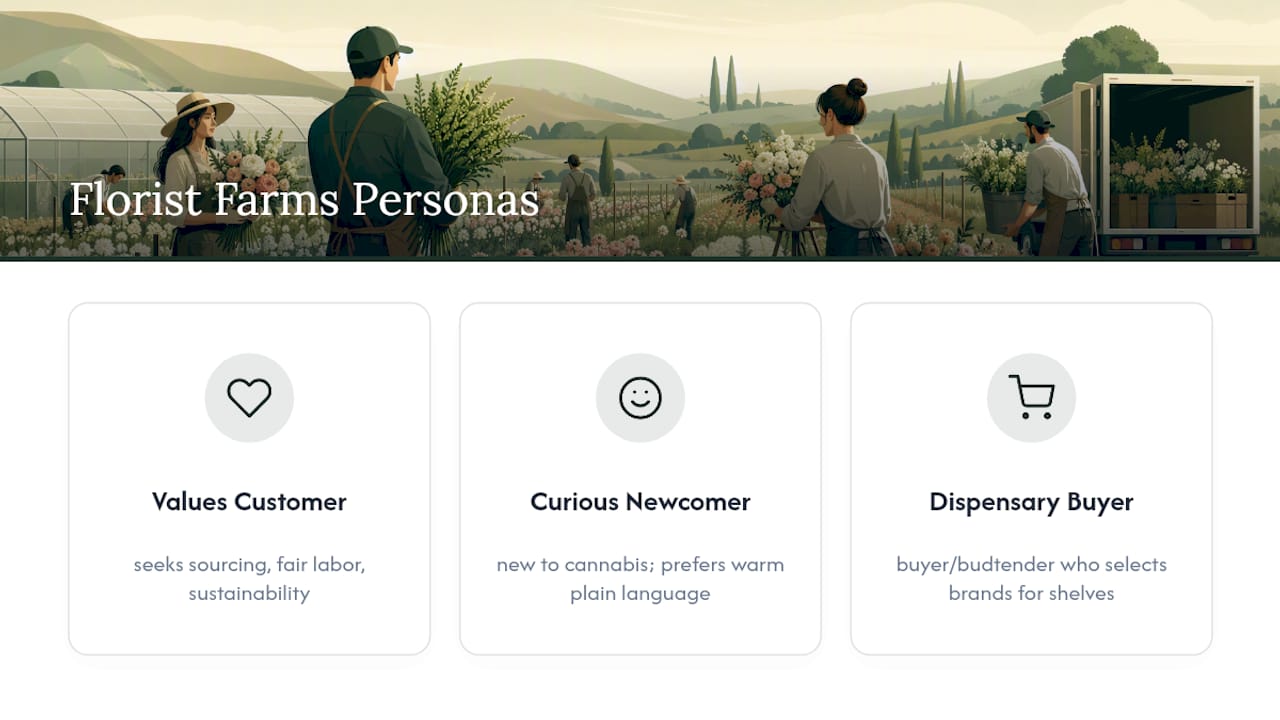
Three rough personas show up consistently in how the brand communicates:
The values-driven regular wants to know a product supports fair labor and real farming practices, and will pay attention to a living-wage claim or a sustainability note on packaging. The curious newcomer is exploring legal cannabis for the first time and responds better to a warm, plain-language voice than to technical potency charts. The dispensary buyer or budtender is a persona too. This is the person deciding which brands get shelf space, and a consistent, well-produced identity signals reliability to a buyer stocking dozens of competing SKUs.
None of these personas respond well to hard-sell language or neon packaging shouting about potency numbers. They respond to a brand that sounds like it actually grew the product it’s selling. Every campaign, every packaging refresh, and every merchandising item should be built with one of these three readers specifically in mind, not a generic cannabis consumer.
A Creative Lead’s Take on Staying Authentic at Scale
Keep one versioned asset library as the single source of truth, and schedule a brand audit at least twice a year. That single habit prevents more inconsistency than any style guide. When platform ad limits box you in, lean harder on owned channels, packaging, and email instead of fighting the algorithm. And when you reach for proof that the product is real and available, use retail signals like Say Less sparingly. Overusing them turns a farm story into an ad.
— Jake
Where to Find Official Florist Farms Assets
For raw visual examples and the full deliverables list, review the BLKDOG case study. For sustainability and sourcing claims straight from the source, check the Florist Farms story page. For the launch timeline and social fairness commitments, see CNY Central’s coverage. If you’re advising on wellness-adjacent copy, the CBD wellness checklist from SMOKO CBD is a useful reference for claims language.
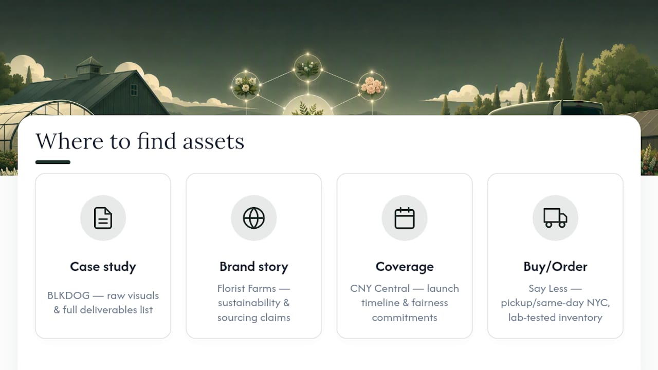
Ready to see the brand in action on shelf? Order Florist Farms products through Say Less for pickup or same-day NYC delivery, backed by lab-tested inventory and straightforward, no-upsell service.
Sources
- Florist Farms, New York | black dog DESIGNS
- Florist Farms lights up the NYS cannabis industry — Cornell CREA REV
- About Us – Florist Farms
- Cortland’s Florist Farms is first legal cannabis brand in NY, prioritizes social fairness — CNYCentral
FAQ
Is Florist Farms a Good Cart Brand?
Florist Farms is best known as a craft flower and farm-focused brand rather than a cart-first company, built around transparency and sustainable growing practices. Shoppers looking specifically for vape carts should check current dispensary menus, since Florist Farms’ identity centers on flower and farm-origin products first.
What Are the Best Florist Farms Strains?
Strain availability rotates by harvest and dispensary, so the “best” pick depends on what’s currently in stock and lab-tested fresh. Checking a dedicated brand page for current lab results and strain listings is the most reliable way to compare options before buying.
Who Owns Florist Farms?
Florist Farms was founded by Allan Gandelman and Karli Miller-Hornick, and the brand launched into licensed New York dispensaries on December 29, 2022. Both founders bring a farming background to the company, which is central to its farmer-first positioning.
What Are People Saying About Florist Farms Social Gummies?
Public commentary on specific edible lines varies by batch and flavor, and detailed product-level feedback isn’t consistently documented in official brand materials. Buyers wanting current details on formulation and lab testing should check the latest listings directly through a licensed dispensary menu before purchasing.