
Official Jeeter logos, colors, and usage guidance live on Jeeter’s own product and brand pages, not on third-party design sites. Three rules govern every use: pull files only from official sources, respect the minimum clear space and size requirements, and never crop or cover regulated cannabis labeling. JEETER is a registered trademark owned by DreamFields Brands Inc., so modified logo treatments or co-branded layouts need written approval. Say Less carries Jeeter in-store, which means designers can inspect real packaging and photography under legal retail conditions before finalizing a mockup.
TL;DR:
- Use only official Jeeter assets, ensuring they are pulled from authorized sources and not modified without written approval.
- Keep the logo at a size and clear space that prevents distortion, crowding, or obscuring, especially for small-format packaging.
- Confirm colors, fonts, and minimum sizes against the current spec files to avoid brand inconsistency and legal non-compliance.
- Verify lab-test, potency, and legal labeling information meets each state’s specific cannabis regulations before final production.
- Request real product samples and merchandising references from Say Less to ensure accurate in-store branding and photography under actual retail conditions.
Table of Contents
- Jeeter Brand Guide Basics: Logos, Colors, and Fonts
- How Should the Jeeter Logo Be Used Correctly?
- Packaging and Retail Merchandising: What Format Changes
- Is JEETER a Registered Trademark?
- Building a Jeeter Brand Approval Checklist
- Notes From Running Jeeter Branding at a Bronx Dispensary
- Order Jeeter and Get Merchandising Support From Say Less
- Sources
Jeeter Brand Guide Basics: Logos, Colors, and Fonts
Getting the visual specs right starts with knowing what assets actually exist and where they come from. Jeeter’s brand system centers on a few core elements that show up consistently across its product categories and pop-up retail activations.
Logo variants. Expect three standard forms: the primary wordmark, a standalone icon or badge mark, and product-specific lockups (Baby Jeeter, Cannons, Quads). Request vector files first.
- SVG or EPS for anything going to print or getting resized, since vector formats scale without quality loss.
- PNG with transparency for web use, social graphics, and digital menus.
- CMYK color profiles for offset or digital print runs, not RGB, to avoid muddy color shifts on packaging.
Color palette. Jeeter leans on a bold, saturated palette built around deep reds and blacks with metallic gold accents, reflecting the premium, pop-culture-driven identity the brand talks about on its about page. Exact hex and RGB values should always be pulled from the current official files rather than eyeballed from a photo or screenshot, since brand refreshes happen and a slightly-off red reads as an error to anyone who knows the brand.
Typography. Jeeter’s marketing materials favor a bold, condensed sans-serif for headlines paired with a cleaner sans-serif for body copy and legal text. If the exact typeface isn’t licensed for your project, ask your Jeeter contact for an approved substitute rather than guessing at a lookalike font, since close-but-wrong typography is one of the fastest ways to make a brand look counterfeit.
Minimum sizes. Small-format packaging, like Baby Jeeter jars, forces the logo down to a fraction of its normal footprint. Confirm a documented minimum reproduction size in points or millimeters before a print run, not after proofs come back illegible.
Pro Tip: Build a one-page spec sheet with your confirmed hex values, minimum sizes, and font substitutions before briefing any vendor. It saves at least one round of revisions on every print job.
How Should the Jeeter Logo Be Used Correctly?
Most brand-consistency failures happen at the execution stage, not the concept stage. A few concrete rules keep Jeeter creative on-brand and QA-ready.
Clear space and minimum sizing. Keep open space around the logo equal to at least the height of the wordmark’s letterforms on every side. Never let text, product photography, or busy patterns crowd that zone, and never shrink the mark below its documented minimum size just to fit a layout.
Common misuses to flag during review:
- Stretching or squeezing the logo to fit a non-proportional space
- Placing the wordmark over a busy photo or low-contrast background
- Recoloring the mark to match a promotional palette without approval
- Adding drop shadows, outlines, or gradients not in the official files
Color swaps are sometimes acceptable, usually for single-color reproduction on foil or embossed packaging, but only when the swap is a documented alternate, not an improvised match.
When Jeeter appears alongside a retailer or partner logo:
- Keep Jeeter’s mark at equal or greater visual weight than the co-branding partner
- Separate the two logos with clear space, never touching or overlapping
- Avoid combining the two into a single lockup unless explicitly approved
Foil stamping and embossing look premium on Jeeter packaging, but any special finish still needs to preserve full legibility of the logo and, critically, the regulated legal copy. A gold foil treatment that looks great under studio lighting can go unreadable under fluorescent dispensary lighting, so proof under real conditions before signing off.
Packaging and Retail Merchandising: What Format Changes
Jeeter’s product lineup isn’t one shape and one label. It’s several distinct formats, and each one changes how much room you have for branding versus required copy.
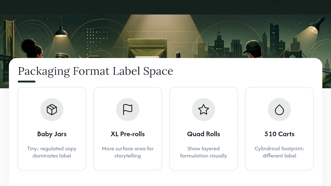
Baby Jeeter jars are small and dense with regulated text, leaving little room for anything but the core logo and product name. XL pre-rolls and Cannons give more surface area for storytelling elements. Quad-infused pre-rolls layer THCa diamonds, rosin, custom terpenes, and a kief coating, and Jeeter’s own product pages describe that construction in detail. Packaging for these should communicate the layered formulation visually without shrinking the lab-test or potency information to make room for it. The 510 vape carts follow yet another footprint entirely, closer to a cylinder than a flat label.
Jeeter’s tactile brand cues, glass mouthpieces, gold foil accents, kief-dusted finishes, need documentation for vendors who won’t see the actual product before manufacturing packaging. Photograph these details in raking light and note the exact finish (matte foil versus reflective, for instance) in the spec sheet.

In-store, Jeeter leans hard into retail theater: pop-up Jeeter Mart activations, contour-cut sintra logos, and SEG fabric backdrops that give the brand a dimensional, non-flat shelf presence, a build style documented by signage vendors working on Jeeter rollouts.

Pro Tip: Request material samples from your signage vendor before a full production run. Contour-cut sintra and SEG fabric behave very differently under store lighting than they do on a screen proof.
Because manufacturing partners vary by state, always confirm production samples and label proofs directly with the product team before finalizing a cross-market packaging run.
Is JEETER a Registered Trademark?
Yes. Public trademark records confirm JEETER is registered to DreamFields Brands Inc., with registration acknowledged on March 25, 2025 under serial number 97979812. That filing covers more than just flower and pre-rolls, extending to apparel and entertainment-related uses, so unauthorized merchandise or novel logo treatments carry real legal risk, not just a brand-guideline violation.
Practical reminders for anyone touching Jeeter creative:
- Use only assets pulled from authorized, official sources
- Request written permission before modifying the mark or building a co-branded lockup
- Never remove, shrink, or obscure state-required labeling (age warnings, potency figures, lab-test references) to make room for branding, regardless of how tight the packaging real estate gets
State cannabis labeling rules differ from market to market, so a layout that’s compliant in one state may not clear review in another.
Building a Jeeter Brand Approval Checklist
A short, ordered process catches most compliance and consistency problems before they reach a printer.
- Pull logo, color, and typography files from official Jeeter sources, never from a prior vendor’s archive
- Confirm exact hex and RGB values against the current files, since brand palettes get refreshed
- Verify font licensing or confirm an approved substitute typeface
- Check clear space and minimum size on an actual production mockup, not just a digital comp
- Cross-check label copy against your state’s cannabis marketing regulations
- Request written trademark usage approval for any modified or co-branded treatment
- Produce a material and spec sheet for POS or signage vendors, including finish notes (foil, matte, embossed)
For QA, run a legibility test at true production scale (not zoomed in on a monitor), confirm color proofs under the lighting conditions the piece will actually live in, and require a physical packaging sample sign-off before any full print run.
Pro Tip: Keep a single point of contact for asset approvals. Split approval chains are where color drift and outdated logos slip through.
For real-world reference points, brand teams can look at how Jeeter appears on Say Less’s own Jeeter product page, which shows current packaging and photography as sold at retail.
Notes From Running Jeeter Branding at a Bronx Dispensary
Executing Jeeter’s brand in a working dispensary is a different exercise than designing it on a screen. Shelf space is tight, lighting is inconsistent, and every merchandising choice has to coexist with state-mandated signage. In practice, staging Jeeter’s quad-infused line for pickup and delivery photography means matching the same raking-light approach used for the tactile foil and kief details, then cropping tight enough to show the product without cutting off required label text.
Say Less checks lab-test data against each batch before it goes on the shelf or into a delivery photo, since a mismatched or outdated certificate undercuts the exact trust the brand’s premium packaging is trying to build. That verification step matters as much to brand consistency as the visual specs do.
— Jake
Order Jeeter and Get Merchandising Support From Say Less
Say Less is the Bronx dispensary that actually stocks Jeeter’s full quad-infused lineup, so if you need to see current packaging, photography, or in-store merchandising before your next print run, you don’t have to guess from a press photo. We can pull product samples and supply real merchandising references on request, whether you’re brief-checking a label proof or scouting how the brand looks under actual retail lighting.
Browse the current Jeeter selection at Say Less to see live packaging and pricing, or check out how to choose cannabis products that match a specific creative brief. Every order requires age verification at 21 and up, consistent with New York’s legal purchase rules, and pickup or same-day delivery is available across NYC. If your team needs merchandising photos or a product sample for an upcoming campaign, reach out through the Jeeter brand page to get started.